 Free entry
Worldle
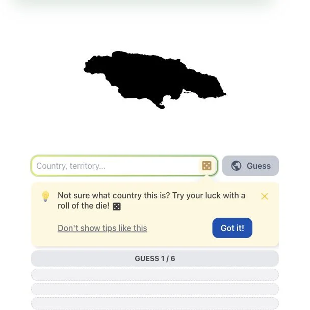
Identify a country or territory from its silhouette, using distance and direction clues.
Daily puzzles
The pattern is visible but its explanation is missing. Test competing metrics with limited peeks, use the revealed units and avoid confusing unavailable data with a low value.
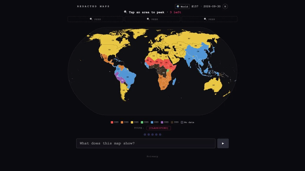
Redacted Maps hides the title or metric of a thematic map instead of hiding a country. Colors show a geographic pattern, and three available peeks let you inspect values in selected areas. The answer is the statistic behind that pattern.
The checked rules describe progressive help after incorrect answers: units, a category, a hint and finally choices. Hatched areas indicate no data. That distinction matters: missing values are not evidence that a country has the lowest measurement. Select peeks to distinguish hypotheses before using the answer field.
Several statistics can produce similar rich-versus-poor or regional patterns. The map alone may suggest a family of metrics without identifying the exact one. A carefully chosen peek tests a prediction: would this country be high under your first hypothesis and low under the second? Units and categories can then rule out whole interpretations. Think about what the variable measures rather than merely naming a topic associated with the warm colors.
A large-country pattern may reflect total counts, while a different distribution suggests a rate or per-person value. Wait for units before assuming the denominator.
Choose an informative exception rather than three neighboring countries with similar colors. Each limited peek should settle a different uncertainty.
Do not read missing data as zero. A country excluded from measurement cannot support the same inference as a country with a low recorded value.
You like data maps and want to explain a global pattern rather than identify one location. It rewards curiosity about units, denominators and exceptions.
You want a straightforward map-name quiz or reliable live statistics for research. The hidden metric and puzzle-specific dataset require interpretation.
Choose a different game based on the experience you want.
The checked legend marks them as no data. Do not treat their pattern as the smallest numerical value or include them in a color ranking.
Choose places that would behave differently under your candidate explanations. A contrasting or exceptional country is usually more informative than another place with the same color.